Status indicators
Status indicators are an important method of communicating severity level information to users. Different shapes and colors enable users to quickly assess and identify status and respond accordingly.
- Overview
- Designing with status indicators
- Icon indicator
- Shape indicator
- Badge indicator
- Differential indicator
- Accessibility
- Related
- References
- Feedback
Overview
Indicators help users notice important changes or issues on a page. They are often used to show notifications, prioritized tasks, statuses, or updates. By drawing attention to specific elements, indicators guide users to what they need to focus on.
In this pattern we explore:
- Choosing the best status indicators for your context
- The different status indicator variants
- What elements they are comprised of and how each element works to communicate
Variants
| Variant | Usage | Use cases |
|---|---|---|
| Icon indicator | Used any time the layout offers ample space and the content requires maximum attention. They require an icon, a shape, a meaningful color and a descriptive inline label. | Most often used in notifications, progress indicators, data tables, task lists, and dashboard widgets. |
| Shape indicators | Useful in smaller spaces or when users need to scan large amount of data. | Most often used in lists, dashboards, data tables, data visualizations, and network diagrams. |
| Badge indicators (with number) | Useful when a count of new or updated items is available, and it is important for the user to know the number of updates. | Most often used in notification panes in the header, and used in conjunction with avatars or icons. |
| Badge indicators (without number) | Useful when new or updated items are available and the number of notifications is unknown or irrelevant to the user. The dot badge is also more compact and discrete. | Most often used in notification panes in the header, and used in conjunction with avatars or icons. |
| Differential indicators | Useful when users are monitoring differentials in large lists of statistics and when anything other than type would be too obtrusive. | Most often used in financial dashboards for highlighting deltas or other types of data visualizations. |
Icon indicators versus shape indicators
Status and shape indicators play a key role in providing feedback and guidance within products. However, they are used in different situations and serve distinct purposes depending on the product’s needs.
Icon indicators reflect system health, notifying users if everything is running smoothly or if issues arise, such as when a task is completed or fails after submitting a form. They provide feedback on the product’s overall state through system-wide notifications.
Shape indicators, as a secondary set of indicators, can be defined differently depending on the product. Their use cases include helping users prioritize tasks, like a red triangle for high-priority tasks, or showing the current phase of a component’s lifecycle, such as activated or deactivated. They don’t always necessarily indicate urgency.
Anatomy
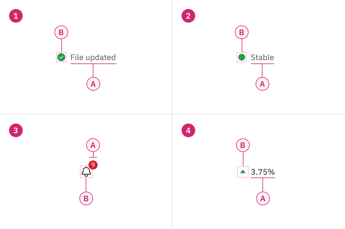
1. Icon indicator
A. Text label
B. Icon (shape, color, and symbol)
3. Badge indicator
A. Shape with or without number (color)
B. Icon (outline)
2. Shape indicator
A. Text label
B. Icon (shape and color)
4. Differential indicator
A. Text label
B. Symbol (optional color)*
*Differential indicators must have either a ‘+’ or ‘-’ sign, a caret, or an arrow icon to indicate positive or negative values.
Designing with status indicators
Choosing for context
Consolidated statuses
When multiple statuses are consolidated, use the highest-attention color to represent the group. For example, if the statuses of underlying components are green, yellow, and red, the consolidated indicator is red.
Cognitive load
Don’t use status indicators when no user action is necessary and status information is not important enough to highlight. Use plain text instead to avoid the overuse of status indicators. While we won’t go as far a prescribing a maximum number, more than 5 or 6 indicators begins to tax a user and makes it difficult to focus.
Standardization
All status icons must be approved and published in the icon library. This guidance only provides the most common status indicators used across products. If your product requires an icon not currently included, please reach out to suggest its addition.
Severity levels
For ease of use, status indicators can be classified into levels of severity such as high, medium, and low attention.
High attention
Use these indicators when immediate user action is required due to a system irregularity, malfunction, or when confirming a potentially destructive action. Examples include alerts, exceptions, confirmations, and errors.
Medium attention
Use these indicators when no immediate user action is required or to provide feedback to a user action. Some examples include acknowledgements and progress indicators.
Low attention
Use these indicators when something is ready to view, for system feedback, or to signify that something has changed since the last interaction.
Visual guidance
To communicate their message, indicators can take many forms—they’re not confined to iconography. There are four basic elements that comprise Carbon status indicators. (Note: we won’t get into animation and sound in this pattern.) And for WCAG compliance, at least three of these elements must be present. Let’s look at these elements more closely before examining specific status types.
- Symbols
- Shapes
- Colors
- Type
Status icons
Icons are visual symbols that represent ideas, objects, or actions. They help communicate messages quickly, encourage interactivity, and highlight important information—like exclamation points for warnings, checkmarks for success, and question marks for help
To keep icons consistent across IBM products, we’ve included only the most widely recognized symbols in the icon library. Some products may have specific modifications or need a more extensive set.
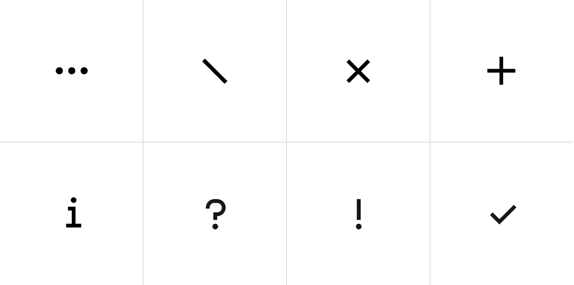
Examples of some of the most common status symbols
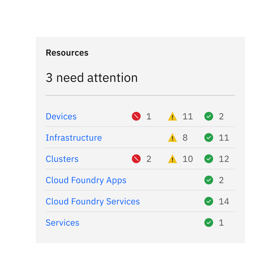
Status shapes
In this context, shapes refer to geometric figures like squares, circles, rectangles, and so on, as they are instantly readable even at small sizes. These shapes have strong visual associations that can be applied to help users succeed in using their product flows. For instance, shapes with straight lines and 90 degree angles usually convey structure and order—like the grid. While shapes with curves are friendlier and symbolize continuity and connection.
There can also be cultural associations connected with shapes. For example in traffic and wayfinding, hexagons mean stop, and upside triangles means yield. Using shapes incorrectly can disturb learned recognition patterns and confuse users, possibly hurting their overall experience.
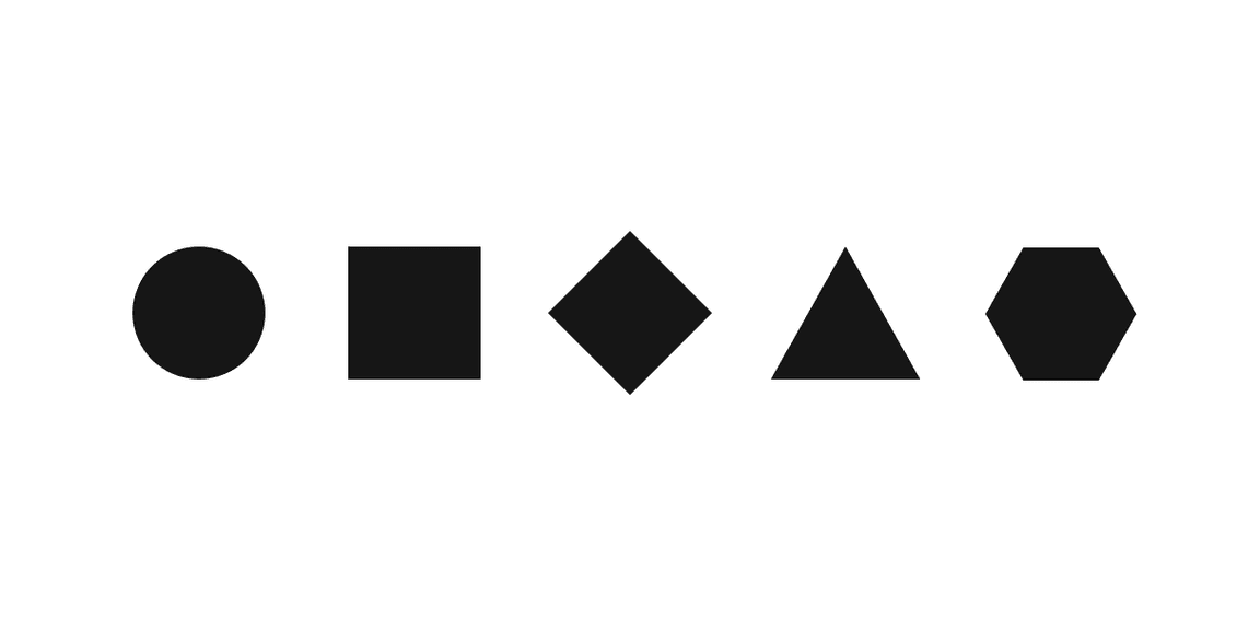
Example of the most common status shapes
Status color palette
The status palette includes all of the colors that can be used to reflect status. Typically, red represents danger or error, orange represents a serious warning, yellow represents a regular warning, green represents normal or success, and blue represents passive notifications, usually involving additional information and workflow progress. This status color palette also includes gray and purple to add more depth to the system. Gray indicates drafts or jobs that haven’t been started, and purple indicates outliers or undefined statuses.
Extended status palettes
This palette is only for added contrast accessibility when using yellows and oranges. It’s not a part of the IBM brand palette and it’s also not included in the v2 color release because it’s for very selective use in data visualizations and certain status indicators. Do not use this palette in any other manner in your layouts.
Icon indicator
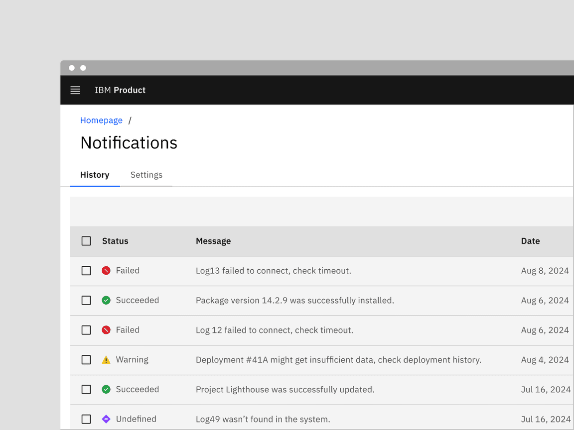
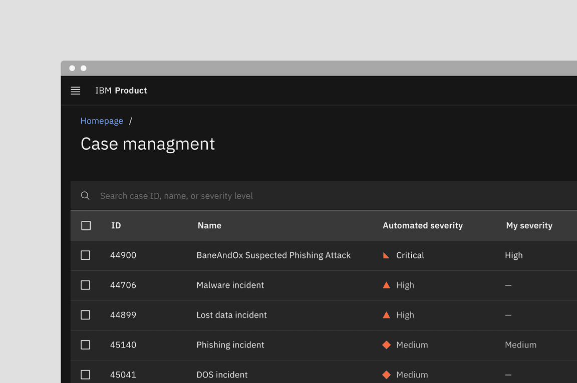
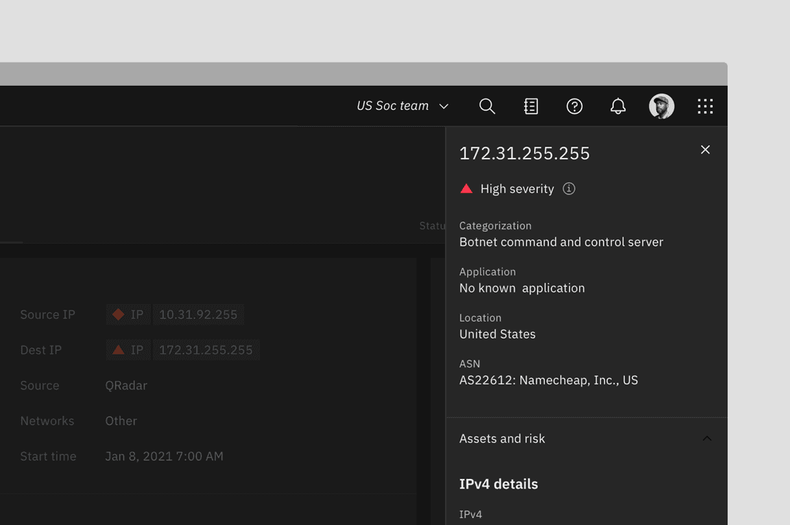
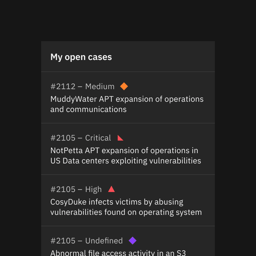
Icon indicators consist of an icon, a shape, a meaningful color, and a descriptive label. They are highly effective for communication and enhance scannability, especially in content-heavy layouts. Common uses include notifications, progress indicators, data tables, task lists, and dashboard widgets.
Notifications are the most prevalent example of this type of status indicator.
These severity levels are not intended to dictate the final status names in your product. They are suggested based on common use cases across products to help you define status names according to your system’s needs.
Used for: failed processes, emergencies, urgent alerts
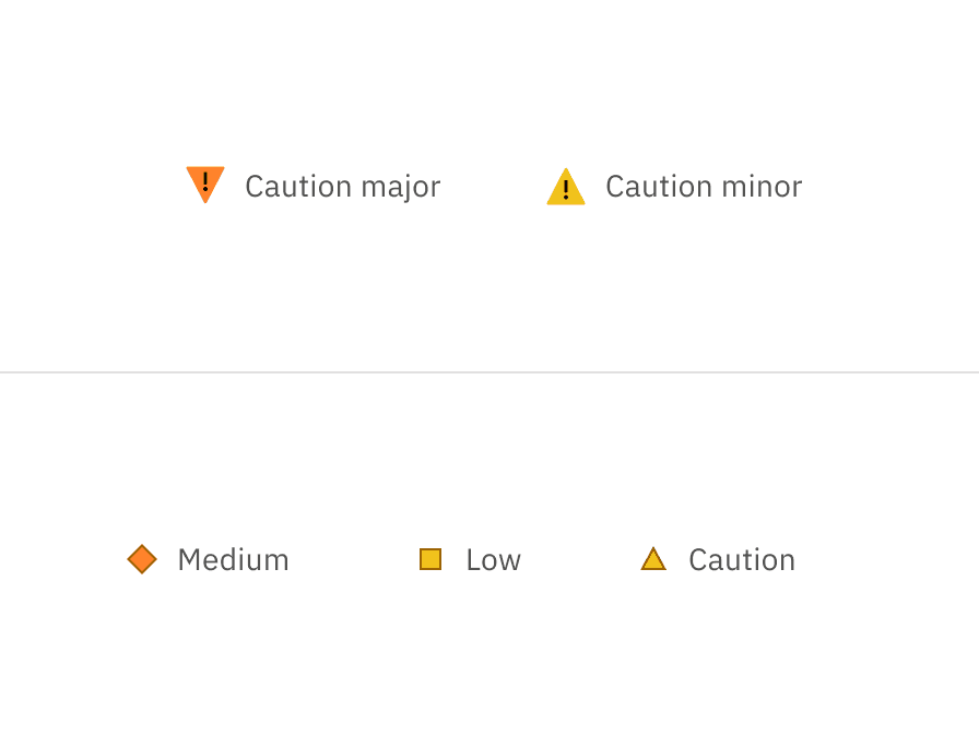
Used for: major caution, serious situations, critical instability
Used for: minor caution, prevention, instability
Used for: experimental work, outliers
Used for: success, completion, stability
Used for: stability, active states
Used for: unfinished, running processes
Used for: incomplete tasks
Used for: upstarted tasks or disabled processes
Used for: indefinite holds
Used for: unknown, undefined status
Used for: additional information, exceptions
Labeling and type pairing
Icon indicators, also known as ‘contextual’ status indicators, are linked to specific UI elements or content and should be placed near these elements for clarity. When the label is not descriptive or paired only with numbers, it’s best practice to provide a heading or additional content to clarify the status intention.
Status indicators within notification have different spacing since they are integrated into the notification component and do not follow the inline spacing rules.
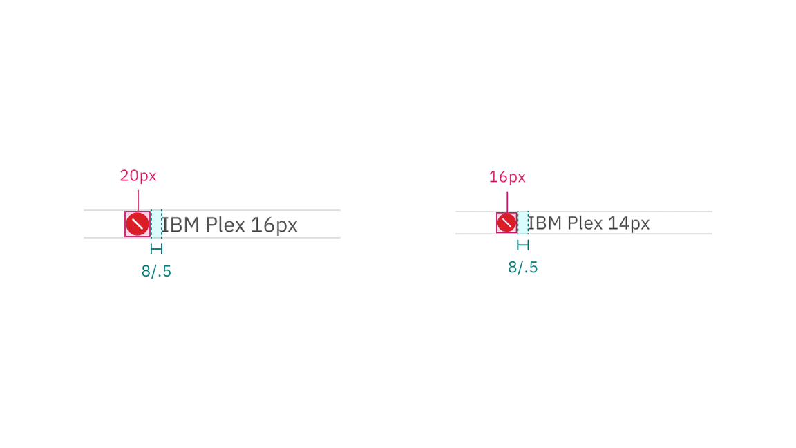
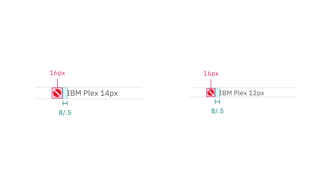
Icon indicators are available in two sizes, each with recommended type size pairings.
Alignment
When stacked vertically, ensure the icons remain left-aligned with the accompanying text for easier scanning.
Do left align icons and type in lists and data tables, regardless of whether you’re using the responsive grid or spacers.
Do not push icons out of alignment with label length. In this case, where the status indicators are flush right, the two digit labels are pushing the icons out of alignment.
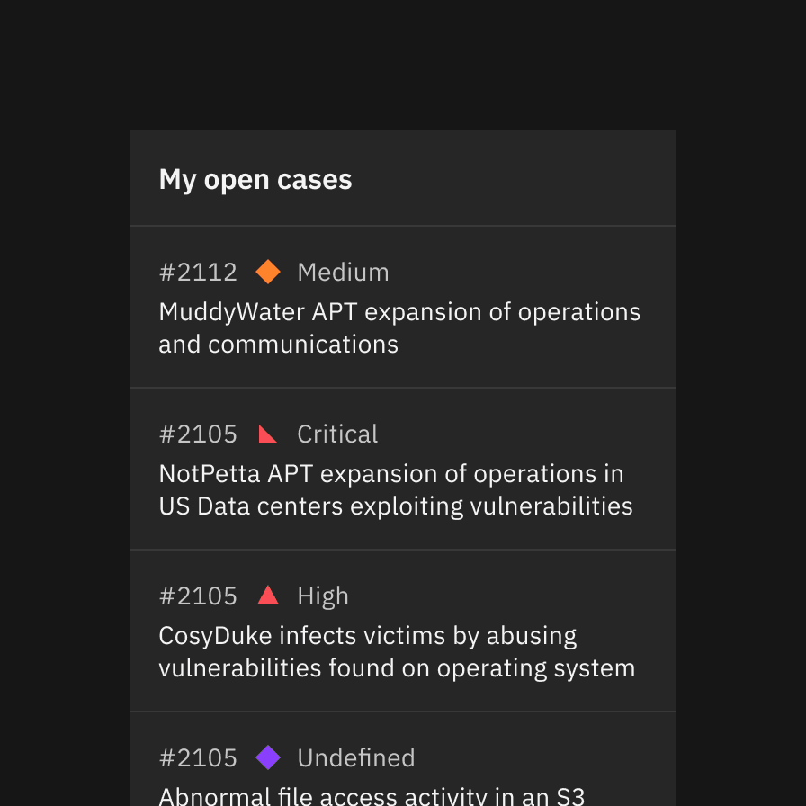
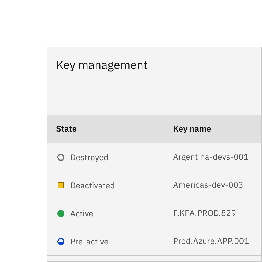
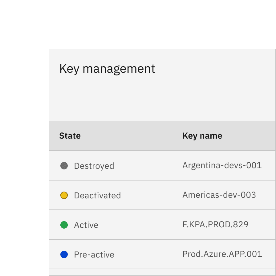
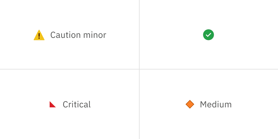
Shape indicator
Shape indicators use a shape, color, and descriptive label to convey the status of a device, feature, or version—without relying on a symbol.
Their use cases include helping users prioritize tasks, like a red triangle for high-priority tasks, or showing the current phase of a component’s lifecycle, such as activated or deactivated. They don’t always necessarily indicate urgency. Shape indicators are also used in diagrams and are designed to remain clear even at small sizes.
Example of the status label directly next to the shape
These severity levels are not intended to dictate the final status names in your product. They are suggested based on common use cases across products to help you define status names according to your system’s needs.
Used for: critical failures, emergencies urgent alerts, deprecation and cancellation
Used for: critical (10) threat, critical risk, critical severity warnings
Used for: high threat (7–9), high risk, high severity warnings
Used for: medium threat (4–6), medium risk, medium severity warnings
Used for: low threat (0–3), low risk, low severity warnings
Used for: minor caution, prevention, instability
Used for: experimental work, outliers
Used for: success, completion, stability, active states
Used for: additional information, wild card
Used for: unfinished, running processes
Used for: unstarted tasks, drafts, disabled processes
Labeling and type pairing
Shape indicators are also ‘contextual’ status indicators. Like the status icons above, assets have been created for the shape indicators that take into account optical alignment.
Shape indicators don’t have the added recognition of an icon, therefore, it’s important that they are paired with a status label.
Shape indicators are available in one size, but paired with two recommended type sizes.
Example shows shape indicator paired with a label
Alignment
When stacked vertically, ensure the icons remain left-aligned with the accompanying text for easier scanning.
Do place shape indicators before labels; they can be placed after other text only if there is no character count variation.
Do not place shape indicators after the labels to avoid pushing them out of alignment.
Best practice
The status shapes offer more flexibility in interpretation compared to status icons, as shapes can have different colors for various situations. For best practices, consider avoiding the use of the same shape with different colors within the same experience.
Do use shape, color, and status labels for better scanning
Avoid using only color and status labels to differentiate your content
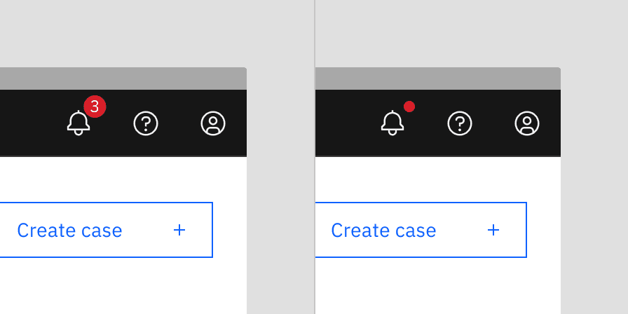
Badge indicator
Badge indicators let the user know that something is new or updated. A badge status is displayed over a ghost icon button, usually in the header, to indicate an active notification and is cleared after the user acknowledges the notification. Depending on your use case, the icon button can open a new page or launch a modal, pane, or flyout.
Examples of badge indicators used for global notifications
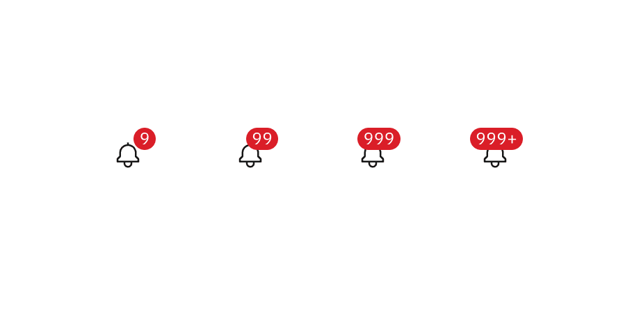
Badge with number
A numbered badge is used when a count of new or updated items is available, and it’s important for the user to know the exact number of updates. This badge has a limit of three digits, with the last character using a plus symbol.
The badge with a number can only be used with the large icon button (48px) as global actions in the UI shell header.
Badges with numbers range from one to three digits
Badge without number
A badge without a number (or dot badge) is used when a new notification is available, but the exact number of notifications is either unknown or irrelevant to the user. This dot badge is more subtle than the numbered badge but still effectively draws the user’s attention to the icon button.
The badge without number is commonly seen in toolbars’ icon buttons.
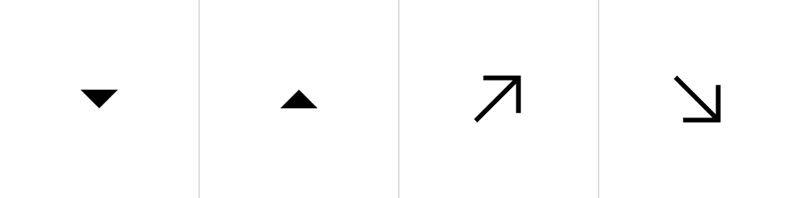
Differential indicator
Differential indicators consist of a symbol, an optional color, and a descriptive label to help users track changes or movements in information. They are especially useful for monitoring differences in large sets of statistics, where more complex indicators might be too distracting. Common examples include color-coded stock symbols in investment accounts that reflect significant price changes. Designers also use differential indicators to highlight deltas in data visualizations.
While typographic indicators can work with just a plus or minus sign, they are most often paired with arrows or caret icons in our system for better clarity.
Color
Differential indicators are either displaying a positive or a negative value. Color is optional in these situations as long as the value has either a ‘+’ or ‘-’ in front of it, a chevron icon, or an arrow icon. Unless the data involves temperature, positive values are represented by the green spectrum and negative values are represented by the red spectrum.
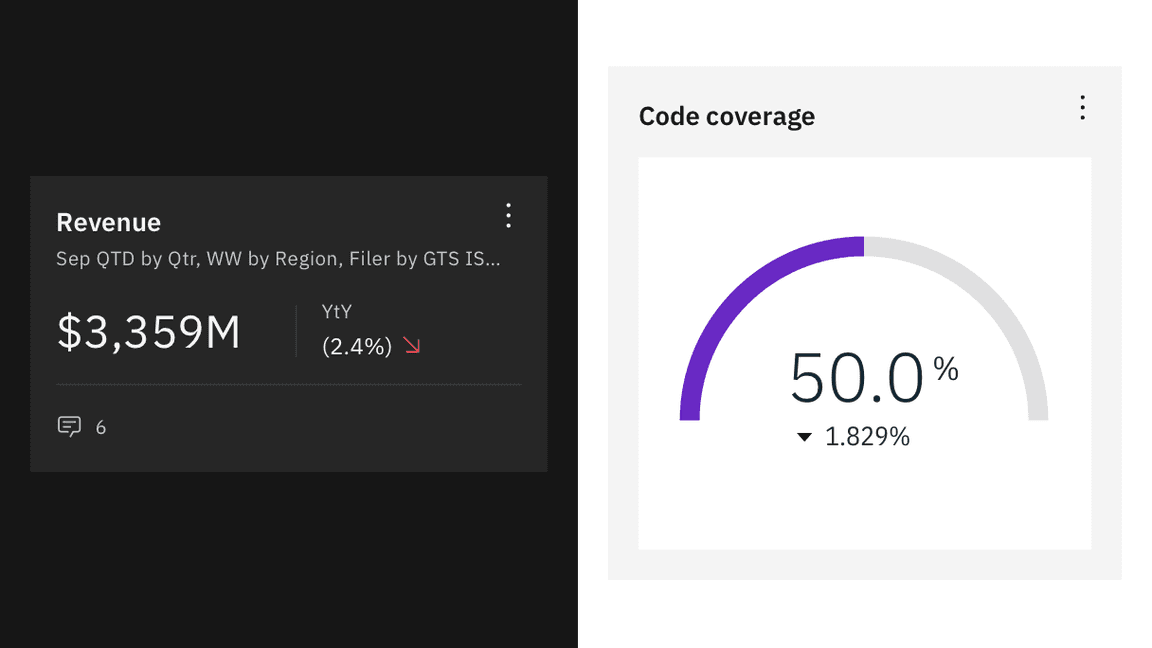
Differential indicators are most often seen in dashboards.
Accessibility
Elements
Relying only on color is insufficient
Relying solely on color to convey status is insufficient, covered by Use of Color, especially for users with color vision deficiencies. While color can be useful, it must be paired with text or other visual cues. To meet accessibility standards, or to pass Non-text Contrast, ensure that there’s at least a 3:1 contrast between colors used for status indicators, as well as between the indicator and the page background. If the contrast is sufficient, even in grayscale, users should still be able to differentiate statuses without relying solely on color.
As a result, status indicators should rely on at least two elements: color, shape, or symbol. When the icon itself meets accessibility standards, pairing it with text helps users better understand and scan the content.
Using symbols alone is acceptable
Using symbols alone is acceptable, as long as they meet non-text contrast requirements. Ensure the symbols have at least 3:1 contrast so all users, including those with visual impairments, can perceive them clearly.
Example shows sufficient status indicators
Outlines
Our current icon indicators are static and used either inline or alongside other components. Since they are not interactive and the symbols have sufficient contrast against their shape colors, outlines are not necessary.
However, shape indicators rely solely on shapes and colors, which might not provide enough accessibility for screen readers and individuals with low color vision. Therefore, using outlines and pairing text with shape indicators is essential to enhance their accessibility, especially with lighter status colors such as orange and yellow in Carbon light themes.
Example shows the icon indicators do not need outlines while icon indicators do due to the lack of symbols
Notifications
Avoid dismissive notifications with a timer for critical messages
Avoid using toast notifications for critical alerts or long messages, as they disappear automatically and may be hard for users with disabilities to fully read. Learn more about No Timing.
Allow users to manage non-critical notifications
Alerts that vanish too quickly can cause important information to be missed. Provide an option to turn off nonessential alerts to improve usability for those with visual and cognitive disabilities. Learn more about Interruptions.
Related
Components
Patterns
References
- Nick Babich, 4 Ways To Communicate the Visibility of System Status in UI, (UX Planet, 2020)
- Aurora Harley, Visibility of System Status (Usability Heuristic #1), (Nielsen Norman Group, 2018)
- Miklos Philips, A comprehensive guide to notification design, (UX Planet, 2020)
- Kim Salazar, Indicators, Validations, and Notifications: Pick the Correct Communication Option, (Nielsen Norman Group, 2015)
Feedback
Help us improve this pattern by providing feedback, asking questions, and leaving any other comments on GitHub.